Hands-On White Balance: Create & Use Your Custom Gray Card for Perfect Color
Ever had that moment when you nail your shot—whether it’s a crisp product photo, a gorgeous portrait, or a dreamy sunset—and then BAM, you open your files and notice a weird color cast? Ugh, right? Don’t worry, friend, a trusty gray card to the rescue! In this guide, we’ll walk through:
- Why a gray card is your color-balance BFF
- When to whip it out in the field (and in post)
- How to DIY one or snag a pro-level tool like the X‑Rite ColorChecker Passport
- Sneaky hacks for tricky lighting and fitting gray cards into your workflow
Grab your favorite beverage and let’s demystify white balance once and for all!
What’s the Deal with White Balance?
Alright, let’s keep it simple: white balance is your camera’s way of saying, “Hey, I know this light is super warm (tungsten) or super cool (overcast)—let me even things out so whites look white and colors stay true.” Think of it as a color-correcting superhero.
Presets? Auto? Sure, they can help in a pinch, but they often get confused—especially in mixed lighting. That’s why a custom white balance using a gray card is the gold standard.
Oh, and a quick PSA: you can nail your white balance all day, but you can’t control how viewers display your images (different monitors, phones, prints—you name it). Your best bet is to get it spot-on from your side, then let the world handle itself!
Why Bother with a Gray Card?
The Magic of 18% Gray
Gray cards reflect 18% of light evenly across red, green, and blue. That mid-tone magic tells your camera or software exactly what “neutral” looks like, no more guessing. This gives you a baseline for color accuracy when shooting, regardless of the lighting conditions.
The Perks
- Bulletproof Accuracy: Say goodbye to stray orange or blue casts.
- Time Saver: Spend less time fiddling in post.
- Creative Freedom: Once you have a true neutral, you can dial in warmth or coolness confidently.
- Batch Bliss: Apply the same correction to an entire shoot in one click.
When to Use It
- When the light’s constantly changing (hello, golden hour!).
- In mixed-light situations (window light meets strobes, candlelight meets LEDs).
- For critical shoots—product photos, brand work, and portraits where skin tones must pop.
DIY Gray Cards (Yes, You Can!)
Want to geek out and make your own? Here’s the rundown:
- Pick a Base: Heavy cardstock or matte plastic works great.
- Grab Some 18% Gray Paint: Available at art stores or online.
- Apply Even Coats: Two to three thin layers, letting each dry fully.
- Seal It: A matte spray finish keeps it looking fresh.
Pros: Cheap, totally customizable, and kind of fun.
Cons: If you’re not precise, your DIY card might not be perfectly neutral.
Pro Tools: X‑Rite & Friends
X‑Rite ColorChecker Passport (My Go-To!)
- Comes with 24 color patches plus an 18% gray and white swatch.
- Includes software to build custom camera profiles (into .DNGs).
- Workflow: Snap a pic of the Passport, import into Lightroom/ACR, run the plugin, and boom—profile applied to your whole shoot.
Other Cool Options
- Datacolor SpyderCHECKR: Similar vibe, slick software.
- Sekonic SpectroMaster: A handheld gadget for precision colormeasurement.
These pro targets cost more but deliver rock-solid consistency and integrate seamlessly into your favorite editing apps.
How to Use It In-Camera
- Position It: Put the card where your subject will be, facing the lens.
- Fill or Spot: Either fill the frame or spot-meter on the card.
- Set Custom WB: Most cameras (Canon, Nikon, Sony, Fuji) have a “Custom White Balance” menu—follow the prompts.
- Check Your Histogram: Your gray card should land around the mid-point (no clipping!).
And always shoot in RAW, JPEG bakes in some guesswork you don’t want. We aren’t going to fight about this. There are times when JPG makes sense, like for sports shooters that are sending images to an editor in real time, but most often if you are capturing that important wedding or amazing sunset, just shoot RAW.
Post-Processing Fun
Eyedropper to the Rescue
- In Lightroom or ACR, grab the White Balance Eyedropper and click the gray patch. Instant magic.
- In Capture One, use the Color Picker on a new layer.
- It doesn’t matter if you are a color purist, looking for the perfect rendering of the color in your shot or if you are looking for a good baseline to work warmth or cool tones into an image (which is my preferred workflow) Starting from a known good color and tone baseline always yields better results.
Custom Profiles
- Upload your gray-card shot.
- Launch the X‑Rite plugin and generate a DNG profile.
- Sync that profile across all your images in one fell swoop.
Once you’re neutral, you can still add a creative twist—like warming up for cozy vibes—without worrying about odd color shifts.
Tricks for Tricky Lighting
- Mixed Zones: Use two gray cards (one in each light) and blend masks in Photoshop. I love this trick. If you have a daylight balanced area and a warmer (incandescent) area, shoot a grey card in each, meter them separately, and mask it. Instant superstar editor.
- Local Tweaks: In Lightroom, set radial or gradient filters with their own WB tweaks.
Got a tiny bag? Pocket-sized cards exist (think credit-card size), and there are even apps available for your phone, but I only use these in a pinch because you have to be careful about the amount of light your phone screen is putting out and can actually cause more havoc when editing than not using a grey card.
Heads up: stay away from shiny cards (glossy glare) and swap out worn ones, accuracy fades over time. I use X‑Rite ColorChecker Passport (#Not Sponsored) and replace it every couple years.
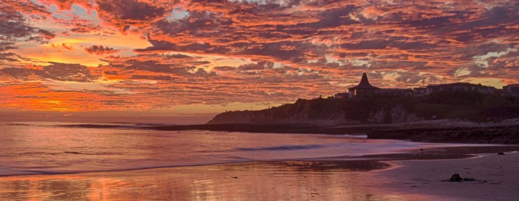
Golden & Blue Hour Strategies
Light changes fast during golden and blue hour, those magical but fleeting windows when colors shift by the minute. Here’s how I stay on top of it:
- First & Last Shot Gray Cards: I always start my shoot with a quick gray-card frame and finish with one at the end. That way, I can apply two anchor points for WB and easily interpolate adjustments between them if needed.
- Timestamp Your Frames: Use in-camera notes or voice memos to mark when each reference shot was taken—this helps when you batch-process or fine-tune in post.
- Watch the Histogram: As the light cools or warms, you may see your midtones drift. A quick peek at your gray-card frame histogram will tell you when to rely more on the final reference.
By anchoring both ends of your session, you ensure consistent color accuracy from first light to last glow.
Making It Habit
- Pre-Shoot Prep: Toss your gray card in a protective sleeve and clean it before the gig.
- First Frame Ritual: Always snap a gray-card frame before your shoot.
- Tag It: Use your camera’s tag/note function so you can spot it in your imports.
Explain to your clients: two seconds with a gray card saves you—and them—loads of post time and nail-perfect colors.
FAQs
- Paper vs. Gray Card? Regular white paper reflects too much and may have a tint. Stick to real 18% gray.
- Replace Frequency? Inspect monthly—if you see wear or scratches, repaint or swap.
- Is JPEG OK? Custom WB helps with JPEG, but RAW gives you way more wiggle room.
That’s a Wrap!
Gray cards might seem geeky, but they’re the secret sauce to color that pops and workflow that flows. Whether you DIY or snag a commercial offering like the X‑Rite Passport, you’ll thank yourself when your colors are spot-on every time.
Got gray-card stories, tips, wins, or horror tales? Drop them in my socials listed below, I love hearing how these little gray rectangles save the day!
Now get out there and get shooting!

“Ted’s journey into the landscape of the human body is a marvelous celebration of all that is physical, sensual and diverse
” – FSTOPPERS
About the author
Ted Tahquechi is a Denver Colorado based professional landscape and travel photographer, disability travel influencer and is almost completely blind. You can see more of Ted’s photography at: http://www.tahquechi.com/
Ted operates Blind Travels, a travel blog designed specifically to empower blind and visually impaired travelers. https://www.blindtravels.com/
Ted’s body-positive Landscapes of the Body project has been shown all over the world, learn more about this intriguing collection of photographic work at: https://www.bodyscapes.photography/
Questions or comments? Feel free to email Ted at: nedskee@tahquechi.com
Insta/X: @nedskee
BlueSky: @nedskee.bsky.social